

Developer Portal
Internal documentation website for developers
This project focused on designing a developer portal that provides a clear and centralized space for developers to access platform documentation. The goal was to reduce friction and bridge the communcation gap, by consolidating technical resources into a single, well-structured interface.
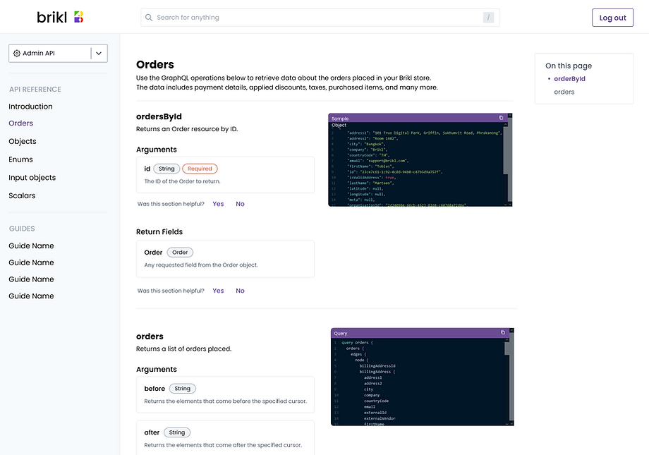
Based on the requirements, the portal was organized into three primary sections. The first covers general documentation related to platform features and functional areas. The second focuses on API documentation, providing technical references and integration guidance. The third is dedicated to SDK documentation, supporting developers with implementation details and usage examples.
First Version
In the first design iteration, I presented the team with multiple layout options that explored different ways developers could access and navigate the documentation. The goal was to evaluate trade-offs between scalability, and ease of navigation.
The first option introduced a dedicated homepage shown after login. This homepage provided a high-level overview of each documentation area in a clear and presentable format, while also incorporating a dashboard-style side navigation for consistent access across the portal. This approach balanced orientation for first-time users with efficient navigation for returning developers.

Version 1: Homepage
Second Version
The second option prioritized speed and efficiency by landing users directly in the documentation, rather than on a separate homepage. Users entered on the internal documentation view, with a dashboard-style sidebar on the left.
The sidebar used collapsible accordion sections to organize documentation areas, along with a clear active-state indicator to help users understand their current location within the system. This approach favored experienced developers who value immediate access to content.

Version 2: Accordion Navigation
Third Version
The third option explored using the header as the primary navigation toolbar, with documentation categories accessible from the top navigation. In this concept, the search bar was moved into the sidebar to reduce its visual prominence, while accordion-based navigation was still used to surface documentation content.
This approach leveraged an existing model, as the top navigation pattern was already familiar to developers from the platform’s Dashboard. However, this option was ultimately dismissed due to scalability concerns. As documentation expanded, the header-based navigation would become increasingly constrained and difficult to extend.

Version 3: Header Navigation
Fourth Version
The fourth option combined flexible navigation with strong content discoverability. It introduced a dropdown selector within the sidebar while keeping the prominent search bar in the top header.
The dropdown allowed users to quickly navigate to specific documentation areas either by selecting an option or searching directly within the dropdown. Below this, accordion sections were used to expose subcategories and page-level content within each documentation area.
This structure supported long-term scalability, making it easier to accommodate additional documentation across the organization without overwhelming the navigation. It balanced speed for experienced users with clarity for those exploring the documentation for the first time.

Version 4: Dropdown Navigation
Ultimately, version four was selected due to its strong scalability and improved discoverability of documentation. The navigation model supported both current needs and future expansion, making it the most sustainable solution.
Shortly after, the company underwent a rebrand, which required the developer portal to be updated to reflect the new brand identity. Although the portal was not publicly accessible, it remained an important internal tool for existing employees and new joiners. As a result, maintaining visual consistency and ensuring continued usability remained a priority.

Rebranded Developer Portal
Post-Release and Rebrand Updates
Alongside the rebrand, we identified opportunities to further strengthen the developer portal.
These included improving the search experience to make documentation easier to find, introducing a feedback system to capture gaps and issues directly from developers, adding a floating index navigation and guide, and ensuring the portal was fully responsive and usable on mobile devices.
Search Experience
Improving search was a critical requirement as developers became more experienced with the codebase and increasingly familiar with the documentation structure. As user knowledge increased, the likelihood that developers would arrive with a clear intent also increased, making a fast and reliable search experience essential.
To address this, I explored two search interaction models. The first option was a semi-detailed dropdown that appeared as users typed, supporting keyboard navigation for quick access to known results.
The second option was a dedicated full-page search experience that returned more detailed results, allowing users to explore broader matches and contextual information when needed.

Quick Access Dropdown Search
There were benefits
-
Does not take users away from their current page, allowing them to quickly abandon the search by clicking outside the dropdown
-
Supports keyboard shortcuts such as arrow keys, Enter, and Escape, aligning with common developer workflows and preferences
But also drawbacks
-
Displays a limited number of results, five in this case, requiring users to be more specific with their queries
-
Requires truncation of result text, limited to approximately 100 characters, which can reduce contextual clarity

Full Page Search Results
Again, there were benefits
-
Provides a more comprehensive set of results, allowing users to explore a wider range of matches
-
Supports richer content, including longer descriptions and clearer context for each result
-
Scales more effectively as documentation grows
But also drawbacks
-
Takes users away from their current page, increasing context switching
-
Slower for quick lookups when users already know exactly what they are searching for
Feedback Feature
While working closely with the technical writer, it became clear that collecting feedback from developers was often challenging. Feedback was typically non-specific or delayed, making it difficult to identify gaps or areas for improvement in the documentation.
To reduce this friction and encourage contextual input, I proposed introducing an in-page feedback system. This allowed developers to provide direct feedback while actively viewing documentation, increasing the likelihood of meaningful and relevant responses. This approach helped create a tighter feedback loop between documentation authors and developers.

To capture deeper insights without increasing friction, selecting either Yes or No reveals a non-intrusive text input for optional follow-up comments. This allows developers to provide additional context only if they choose to.
The prompt text adapts based on whether the feedback is positive or negative, encouraging more relevant and actionable responses while keeping the interaction lightweight and respectful of the developer’s workflow.

Floating Index & Guides
The technical writer also identified the need for guides, a broader form of documentation focused on shared knowledge such as programming languages, frameworks, and developer tools.
These guides were intended to provide foundational context within the portal, supporting both onboarding and ongoing learning.
To support guides, the navigation model needed to evolve. A dedicated section for guides was added to the page list within the sidebar, ensuring they were easy to discover and clearly separated from reference-style documentation.
We moved away from using sidebar accordions to expose page content. Instead, we introduced a floating index that used navigable anchor points to allow users to jump directly to relevant sections within the page. This pattern better suited long-form content, reduced navigation clutter, and enabled faster scanning and movement through documentation.
Mobile Reponsive
It was also important to make the developer portal mobile-friendly, ensuring documentation could be accessed on the go while remaining legible, navigable, and usable across different screen sizes. This supported flexibility for developers and reinforced the portal’s role as a reliable reference at any time.
